Poor air quality is one of the biggest public health threats of our time (United Nations Environment Programme [UNEP]). Research suggests that air pollution can cause a myriad of health problems ranging from allergic reactions to chronic diseases (e.g., ischemic heart disease, stroke, chronic obstructive pulmonary disease, and lung cancer) (World Health Organization [WHO]). Killing between 7 and 9 million people per year, air pollution is the second leading risk factor for early death after high blood pressure (Clean Air Fund). To put it in perspective, the death toll from air pollution is nearly three times greater than that from malaria, HIV/AIDS, and tuberculosis combined (Nicolaou & Checkley, 2021).
“Everyone has the right to live in a clean, healthy environment. Air pollution violates this right for 99 per cent of the world’s population.”
— Inger Andersen, UNEP Executive Director
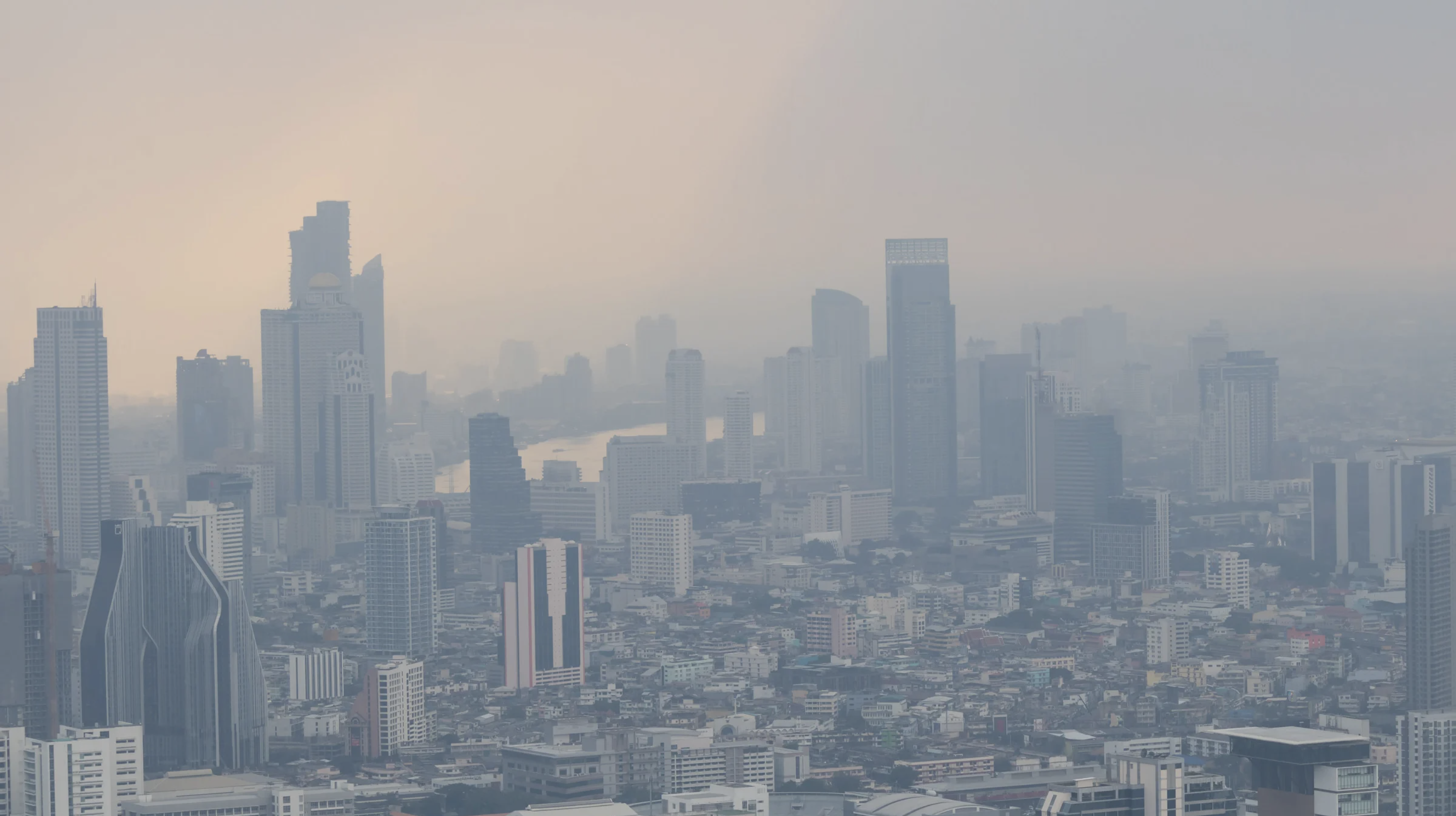
Air pollution is a global issue — according to the WHO, approximately 99% of the world’s population breathes unsafe air. Despite this, many regions still lack access to air quality monitoring. Making matters worse, the countries that need air quality monitoring most are often the ones who have the least access to it. 97% of cities with populations of more than 100,000 in low- and middle-income countries do not meet the WHO air quality guidelines, compared to 49% in high-income countries — these same countries have the fewest air quality monitors (Nicolaou and Checkley, 2021).
“People living in lower and middle-income countries are the most exposed to air pollution. They are also the least covered in terms of air quality measurement.”
— WHO
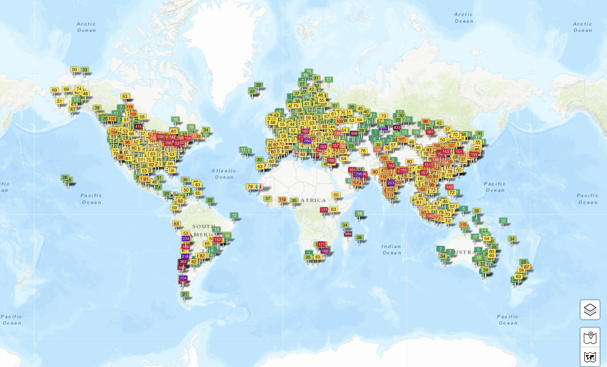
The graphic below depicts the distribution of air quality sensors worldwide — each pin represents one sensor. These sensors collect data on the presence of air pollutants in the atmosphere within a defined geographical radius (varying from sensor to sensor). Based on measurement of key air pollutants, the Air Quality Index (or AQI) is calculated, which can provide important information on health risks to people. The color of the pin indicates the quality of air with green being the safest and red/purple being the most dangerous. Notice how many sensors there are across North America, Europe, and high-income Asian countries — notice the colors (lots of green and yellow pins). Notice how few monitors there are in Africa, South America, and low-income Asian countries — notice the colors (lots of orange, red, and purple pins).
Data on air quality is important because it enables stakeholders to take informed action to mitigate air pollution. Data empowers scientists to assess pollution risks accurately; policy makers to enact more effective air quality reforms; healthcare workers to better treat their patients; and environmentalists to protect our ecosystems. Without this data, vulnerable populations are left exposed, and those that can make a difference are left to navigate these dangers blindly.
“Without robust air pollution measurement equipment in place, these countries do not have access to the air quality data required to understand and act on pollution trends.”
Clarity Movement
During the fall 2024 semester, my peers and I took a closer look at global disparities in air quality monitoring. Our team consisted of Dakota Taufeeq, a sophomore studying Environmental Science & Business Administration; Sophy Gao, a sophomore studying Data Science with a minor in Sustainability; and myself, a second-year master's student studying International Development Practice with a concentration in Sustainable Livelihood and Environment. As a part of our ENVS 326/526: Climate Change and Society course, we summarized our findings in an interactive digital story map. We invite you to explore our story map here.
Specifically, I want to draw your attention to the case studies we mapped to give our audience an idea of the differences in data availability by region. We selected two cities from each continent to offer a diverse sample. For each city, you will see the average annual AQI, as well as annual average concentrations of particulate matter (PM2.5 and PM10) and other gaseous air pollutants, including ozone (O3), nitrogen dioxide (NO2), sulfur dioxide (SO2) and carbon monoxide (CO) — if such data is available in that region. You will also see the health implications that can be identified based on this data. Notice how access to data differs by city. We invite you to review the case study map in the video.
The disparities are glaring. Low- and middle-income countries have the worst air quality and the least amount of data to inform interventions. These same countries emit the least greenhouse gases but are simultaneously experiencing the most extreme impacts of climate change — including those related to air pollution (e.g., smoke from increased wildfire smoke, prolonged pollen seasons). Thus, our team calls upon non-governmental organizations, Global North governments, and other concerned entities to take a bold step to promote equity and help distribute low-cost air quality sensors to developing and under-developed countries that are disproportionately affected by air pollution.
As a part of this effort, one of my teammates, Sophy, developed social media graphics that can be shared to spread awareness about this issue. We also created a corresponding hashtag: #DataforCleanAir. We were thrilled to partner with the WHO Breathe Life Campaign who is now hosting our story map on their webpage. We are appreciative of their support in amplifying our message. By raising public awareness through tools like our story map and communication materials, we hope to spark action and greater investment in air quality monitoring, especially in the communities that need it most.
Acknowledgements: As I reflect on this project, I cannot go without thanking our professor, Dr. Eri Saikawa, whose facilitation and expertise made this project possible. Eri is, without a doubt, the most empathetic professor I have had the privilege of learning from. I am endlessly grateful for her trust in her students and her commitment to participatory leadership. I would also like to thank Tyler Stern, our teaching assistant, for his input and creative direction throughout the development of this story map — his insight played an important role in shaping the final story map.